![](https://nanika.design/wp-content/uploads/nui_normal.png)
「はい」「いいえ」ボタンって左右どっちに配置したらいいんだっけ…?
UIデザインを考える時によくある疑問の1つですね。
この記事では、
はい(Yes)
→押す可能性が高い(重要度が高い)プライマリボタン
いいえ(No)
→2番目に押す可能性が高いセカンダリボタン
と仮定して、「はい(Yes)」ボタンを左右どちらに配置すべきか考えていきます。
![](https://nanika.design/wp-content/uploads/nui_normal.png)
それではさっそく、それぞれの意見を見ていきましょう!
「はい」ボタンは左派の意見
![プライマリボダンは左に配置する](https://nanika.design/wp-content/uploads/1162_left.jpg)
語順や語感に馴染みがあるから
![プライマリボダンを左に配置する例(「はい/いいえ」の方が馴染みがある)](https://nanika.design/wp-content/uploads/1162_04.jpg)
![](https://nanika.design/wp-content/uploads/pt04_01g.png)
「はい/いいえ」か「いいえ/はい」だったら、
「はい/いいえ」の語順のほうが馴染みがあるのではないでしょうか。
![](https://nanika.design/wp-content/uploads/nui_normal.png)
語順や語感から考えて、「はい」ボタンは左側だという意見ですね。
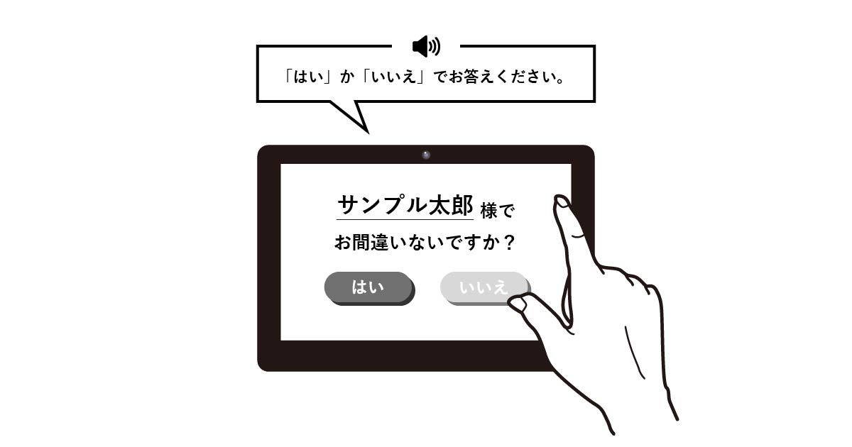
「 [はい] か [いいえ] でお答えください」という音声ガイドがある場合は、音声に合わせて [はい] [いいえ] の順で配置することもありそうです。
![](https://nanika.design/wp-content/uploads/nui_normal.png)
ちなみに私が高齢者向けのデザインを担当した際には、
クライアントから「はい/いいえの順でボタンを配置してください」と指定がありました。
理由は「年配の方は、はい/いいえの順に馴染みがあるから」でした。
誤ってボタンを押すのを防ぐため
![プライマリボダンを左に配置する例(誤って「はい」を押すミスを防ぐ)](https://nanika.design/wp-content/uploads/1162_03.jpg)
![](https://nanika.design/wp-content/uploads/pt03_01g.png)
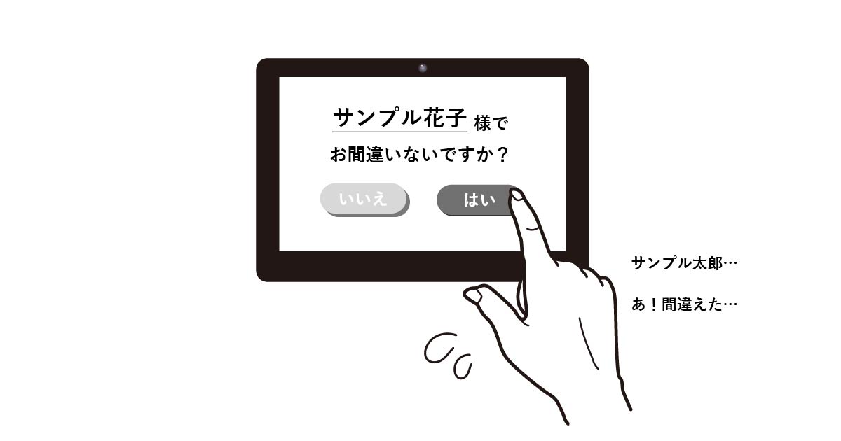
右利きの人にとっては右ボタンが押しやすいので、誤って押してしまう可能性があります。
「いいえ」をあえて右に配置することで、誤って「はい」を押すミスを防ぐことができます。
![](https://nanika.design/wp-content/uploads/nui_normal.png)
トラブルやミスを避けるため、押しやすい右ボタンにあえて「いいえ」を設置するということですね。
「はい」ボタン以外でも「発注する」「同意する」ボタンなど、なるべくユーザーの誤操作を避けたいボタンは、あえて左側(押しにくい)に配置することもあるようです。
確かに、右利きだとタッチパネルでは右ボタンが押しやすいですね。
※ちなみに、右利きと左効きの割合は「9:1」だそうです。
「はい」ボタンは右派の意見
![プライマリボダンは右に配置する](https://nanika.design/wp-content/uploads/1162_right.jpg)
視線の流れが自然だから
※身近な例(パスワードの入力)をもとに、参考画像を「OK/キャンセル」ボタンに差し替えています。
![プライマリボダンを右に配置する例(自然な視線の流れ)](https://nanika.design/wp-content/uploads/1162_05.jpg)
![](https://nanika.design/wp-content/uploads/pt05_01g.png)
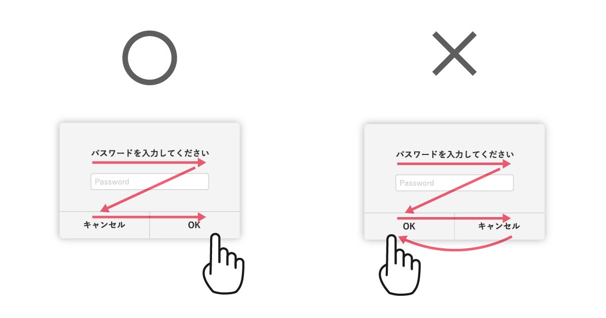
視線の流れ(Z型)で考えると、最後になるのは右ボタンです。
そのままボタンを押すアクションに移れるので、右に「はい」ボタンを設置するのが自然な流れだと思います。
![](https://nanika.design/wp-content/uploads/nui_normal.png)
視線の流れで選んだパターンですね。
視線の流れが自然でアクションも少ない(左上→右下に視線が流れて、また左下に戻る必要がない)ため、ユーザーの負担軽減になるという意見もあります。
右は「進む」のイメージが強いから
![プライマリボダンを右に配置する例(直感的に理解しやすい)](https://nanika.design/wp-content/uploads/1162_01.jpg)
![](https://nanika.design/wp-content/uploads/pt02_01g.png)
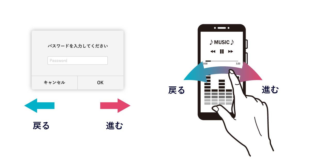
ページネーションやナビゲーションから考えて、右は「進む」のイメージが強いです。
次のステップに進む「はい」ボタンも右に配置した方がいいと思います。
![](https://nanika.design/wp-content/uploads/nui_normal.png)
ユーザーが直感的に理解しやすいということですね。
Apple、Google、Microsoftのデザインガイドラインでは
![](https://nanika.design/wp-content/uploads/nui_normal.png)
ここまで右派・左派の意見を見ていきましたが、大手企業のデザインはどうなっているか見ていきます!
Apple『Human Interface Guidelines』
Appleの『ヒューマンインタフェースガイドライン』(2023年4月参照)のMac OS の項目では、以下のように記載されています。
Dialog with dismissal buttons (like OK and Cancel)
Lower corner, opposite to the dismissal buttons and vertically aligned with them
ダイアログに解除ボタン(OKやキャンセルのようなもの)が付いている場合:
下隅、解除ボタンと反対に垂直方向に整列させる
「はい」ボタンを左右どちらに配置するかについて、断定した記載は見当たりませんでした。
ただし、ページの最上部のメインビジュアルでは、セカンダリーボタンを左、プライマリーボタンを右に配置しています。
Google『Material Design 3』
![](https://m3.material.io/static/assets/m3-social.jpg)
Googleの『マテリアルデザイン』(2023年4月参照)でも、断定した記載は見当たりませんでした。
ページ内の画像を見てみても、プライマリーボタンは左・右どちらのパターンもありました。
ボタン配置の左右にこだわらず、強調レベルに合わせてボタンのデザインを適切に選ぶことを勧めています。
強調性の高い「塗りつぶしボタン」をプライマリーボタンとしています。
Microsoft『Microsoft Design』
![](https://learn.microsoft.com/en-us/media/open-graph-image.png)
Microsoftの『マイクロソフトデザイン』(2023年4月参照)でも、こちらのページでは断定した記載は見当たりませんでした。
ただし、Windowsのプラットフォームでは、否定的なボタン(キャンセル、いいえ等)が右側になっています。
![](https://nanika.design/wp-content/uploads/nui_normal.png)
どの企業のガイドラインも「プライマリーボタンは右(もしくは左)!」とはっきりと記載はしていませんが、
明確なデザインルールは存在しているようです。
その他の意見
![](https://nanika.design/wp-content/uploads/nui_normal.png)
UIやアートワークに関する制作話などを発信しているカプコン公式アカウントのツイートです。
「重要なのは全体でルールが統一されていること」!
まとめ
「はい」ボタン(プライマリーボタン)は
左右どっちに配置する?
左派の意見 | 右派の意見 | その他の意見(どっちでもいい) |
---|---|---|
語順や語感に馴染みがあるから | 視線の流れが自然だから | 強調レベルに合わせてボタンをデザインすることが大事 |
誤ってボタンを押すのを防ぐため | 右は「進む」のイメージが強いから | 全体でルールが統一されていることが大事 |
以上、『「はい」「いいえ」ボタンは左右どっちに配置する?』でした!
![](https://nanika.design/wp-content/uploads/nui_normal.png)
最後におすすめ書籍を紹介します!
「UX」を軸に、Webサイトを制作・デザインするときに必要な考え方や法則を解説しています。
UXと理論で作る Webデザイン: デザイナーでなくてもわかる
誰でも「機能的で効果のあるUI」を作れるようになるためのデザイン解説書です。
誰でもつくれる!UIデザイン入門: 機能するUIの基本と実践 Compass Booksシリーズ
Googleが開発したデザインシステムで、「直感的で分かりやすいUIを実現すること」を目的とした解説書です。
基礎から学ぶマテリアルデザイン3: Googleが提唱するUIデザインの 最新バージョン 「マテリアル3」の基礎を…
![](https://nanika.design/wp-content/uploads/nui_normal.png)
なんと今回紹介した本は、すべてKindle Unlimitedで読み放題!
![](https://nanika.design/wp-content/uploads/nui_normal.png)
今なら初回30日は無料体験できるので、ぜひお試しください!